Friday night I spent about 6 hours on it.
Minus a few minor modifications, I had been using the original design I started with 2 years ago. I liked it as it was fairly simple and allowed for a lot of space for code (as opposed to the limited width blogger templates). In fact, anytime a technical friend starts one up, I suggest the use of a screen wide template because inevitably, their code examples will not look so good.
First thing I did was remove almost all of the <div>/<span> tags. I've never liked them. I prefer the old <table> tag approach. Of course I am not a web guy or designer by trade, so I probably miss out on the advantages...actually, I don't use them like they do so who cares. Apparently the differences are great amongst some in the web community, religious I would dare to say. Table tags are like putting the commas where they should go, at the end of the line. The span/div tags are like putting them in front.
That was tedious to say the least.
Also inspired by Rich's redesign of their social media buttons:

I decided to do the same. A couple of times. What's up top is what I ended up with. A brief survey on Twitter has some people not liking them. What do you think?
I like them because I made them (mostly). Of the 6 hours, probably 4 were spent in Gimp trying to create those silly things. The idea was simple, I wanted more real-estate on the side and there seemed to be a bit of unused space up top.
Tell me what you think in the comments. Good? Bad? Indifferent?
While I'm on the subject of the blog, I've been trying to reconcile the differences in numbers between the statistics that are gathered. There are three services I use: GoDaddy, their default web server statistics they provide, Google Analytics which I've been using since the beginning, and most recently, Quantcast.
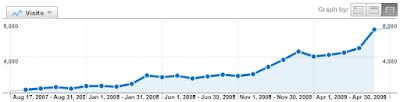
Here are the last 2 years from Google Analytics:
Here they are from the web server statistics (GoDaddy):
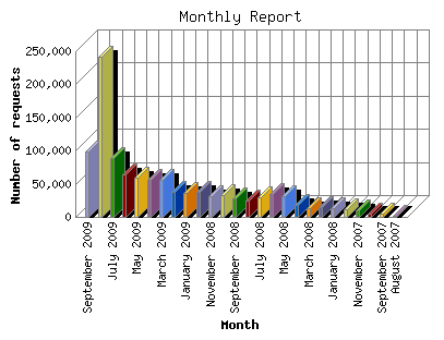
I have no idea what that large spike is...here are the numbers for the last 9 months:
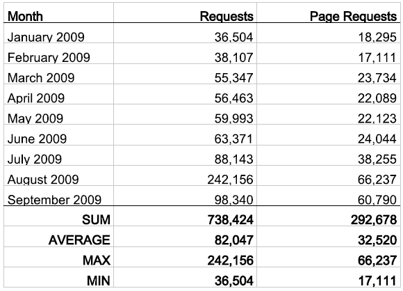
Of course there is no explanation of what is a "request" and a "page request." I'm pretty sure I've never had 242K hits. I can only assume that "request" includes all the objects that are downloaded with each page (css/images/javascript/etc). Which leaves me with page requests. Neither Analytics or Quantcast has ever shown a number in the tens of thousands (though last month did show a total of about 10k page views). Not really sure what to make of it though. I'd love to say that I'm getting 60K hits per month, but I don't believe that to be the case.
Anyway, if you know the difference let me know.
12 comments:
I love it! I am glad you retained the job clock. I miss the 'time since I broke production' clock.
ted,
thanks for the reminder of that clock. ;)
Thumbs up on the redesign and the icons. Maybe your high request numbers are from RSS readers or something?
john,
that might help to explain a bit...but according to feedburner, i have, on average, between 50 and 60 subscribers. not sure that would make up the deficit.
grassy ass on the redesign though!
I like your blog design because it is very simple, clear and nice looking. I don't have appropriate web design skills to make design accord to my wishes but someday I will make something similar to your design - clear and simple :)
marko,
thank you!
i think my limited design skills actually help me...i could probably make it fancier, but it would get unwieldy, for me anyway. i use the google home page as my template, start simple, stay simple.
chet
The link to your LinkedIn profile is not a valid link. At least it wasn't when I clicked on it.
Have you ever thought about a better Blog comment system? I really liked Disqus when I was blogging.
It is an unfortunate byproduct of blogger (at least hosted at my own domain). I like disqus as well. Until I make the switch to wordpress (or maybe even posterous), I'm stuck with it.
Will fix that link...gracias.
Odd. that must be a domain thing. I had no trouble getting disqus on my non-hosted blogger blog.
chances are it is available and i am just too lazy to find it.
The other design seemed cleaner to me.
But maybe I'm just getting old and like things that don't change.
Haha...remember I can use the words "old" and any pronoun or proper noun that refers to me in the same paragraph ...you can't!
But hey, fresh is good, and everything is a step toward something else, right?
As for the inspiration of AppsLab, I do see the resemblance. I'd recommend avoiding changing things in a way that makes them look like something else. Admittedly this happens easily as a result of the subconscious (http://www.youtube.com/watch?v=f29kF1vZ62o) so the effort to avoid the duplication (even if it's an approximate duplication...or is "approximate duplication" too much of an oxymoron?!!) needs to be intentional and vigilant, even.
This is potentially a long and highly-nuanced subject, since an intentional avoidance of something specific can cause awkward and unnatural results as much as a subconscious duplication can cause non-discrete and impersonal results.
That's solid growth. Keep it up :)
Post a Comment