by Victor Fagundo
The argument over why Businesses should abandon Excel in favor of more structured tools has been raging for as long as I have had more than a casual exposure to Oracle products. From the standpoint of an IT user Excel appears to be a simplistic, flat-file-based, error-prone tool that careless people use, despite its obvious flaws. Petabytes of duplicative Excel spreadsheets clog network drives across the globe; we as IT users know it, and it drives us crazy. Why, oh why, can’t these analysts, project managers, and accountants not grasp the elegant beauty of a centralized database solution that ensures data integrity, security, and has the chops to handle gobs of data, and abandon their silly Excel sheets?
I’ll tell you why: Excel is better. Excel the most flexible and feature-rich tool for organizing and analyzing data. Ever. Period.
For the past few years I have lived in a hybrid Finance/IT role, and in coming from IT, I was shocked at how much Excel was used, for everything. But after working with Excel on a daily basis for several years, I am a convert. An adept Excel user can out-develop any tool ( BI, Apex, Hyperion, Crystal Reports ) handily. (when dataset size is not an issue). Microsoft has done too much work on Excel, made it too extendable, too intuitive, built in so much, that no structured tool like BI, APEX, SAP, Hyperion will EVER catch up to its usability/flexibility.
Take this real-world example that came across my desk a few months ago: for a retail chain define a by-week, by-unit sales target, and create a report that compares actual sales to this target. Oh, and the weekly sales targets get adjusted each quarter based on current financial outlook.
How quickly could you turn around a DW/BI solution to this problem? What would it involve?
• Create table to house targets
• Create ETL process to load new targets
• Define BMM/Presentation Layers to expose targets
• Develop / test / publish report.
A day? Maybe? If one person handled all steps (unlikely, since the DB layers and RPD layers are probably handled by different people.)
I can tell you how long it took me in Excel: 3 hours (OBIEE driven data-dump, married with target sheet supplied to me). I love OBIEE, but Excel was still miles faster/more efficient for this task. And I could regurgitate 6 other examples like this one off at a moment’s notice.
Case in point: 95% of the data that C-level executives use to make strategic decisions is Excel based.
If you’ve ever sat in on a presentation to a CEO or other C-level executive at any medium to large sized company, you know that people are not bringing up dashboards, or any other applications. They are presenting PowerPoints with a few (less than 7) carefully massaged facts on them. If you trace the source of these numbers back down the rabbit hole, your first stop is always Excel. Within these Excel workbooks you will find “guesses” and “plugs” that fill gaps in solid data, to arrive at an actionable bit of information. It’s these “guesses” and “plugs” that are very hard to code for in an environment like OBIEE (or any other application). Can it be done? Yes, of course, with gobs of time and money. And during the fitful and tense development, the creditably of the application is going to take major hits.
Given the above, the usefulness of OBIEE might seem bleak. But I strongly feel that applications such as OBIEE do have a proper place in the upper organizational layers of modern business: Facilitating the Tactical business layers, and providing data-dumps to the Strategic Business layers.
Since this post is mainly about Excel, I will focus on how OBIEE can support the analyses that are inevitably going to be done in Excel.
Data Formatting, Data Formatting, FORMATTING!! I can’t stress this enough. For an analyst, having to re-format numbers that come out of an export so that you can properly display them or drive calcs off them in Excel is infuriating, and wasteful. My favorite examples: in a BI environment I worked with percentages were exported as TEXT, so while they looked fine in the application, as soon as you exported them to Excel and built calcs off them, your answer was overstated by a factor of 100 (Excel understood “75%” to be the number 75 with a text character appended, not the number 0.75).
Ask your users how they would like to SEE a fact in Excel: with decimals or not? With commas or not? Ensure that when exported to Excel, facts and attributes function correctly.
“Pull” refreshes of information sources in Excel. In the finance world, most Excel workbooks are low to medium complexity financial models, based off a data-dump from a reporting system. When the user wants to refresh the model, they refresh the data-dump, and the Excel calculations do the rest. OBIEE currently forces a user to “push” a new data-dump by manually running/exporting from OBIEE and then pasting the data into the data-dump tab in the workbook. What an Excel user really desires is to have a data dump that can be refreshed automatedly, using values that exist on other parts of the workbook to define filters of data-dump. Then all the user needs to do is trigger a “pull” and everything else is automated. Currently OBIEE has no solution to this problem that is elegant enough for the common Excel user. (Smartview must have its filters defined explicitly in the Smartview UI each time an analysis is pulled.)
The important part to take away from these 2 suggestions, and this entire post, is that to maximize the audience of OBIEE, we must acknowledge that Excel is the preferred tool of the Finance department, due to its flexibility, and support friendly exports to Excel as a best practice. We must also understand that accounting for this flexibility in OBIEE is daunting, and probably not the best use of the tool. If your users are asking for a highly complex attribute or fact, that is fraught with exceptions and estimations, chances are they are going to be much happier if what you give them is reliable information in a data-dump form, and allow them to handle the exceptions and estimations in Excel.

Showing posts with label vfagundo. Show all posts
Showing posts with label vfagundo. Show all posts
Monday, October 21, 2013


Tuesday, August 13, 2013
Conditional Formatting of Calculated Items in OBIEE 11g
By Victor Fagundo
As people searched for a work around to this problem 3 common solutions have arisen:
Now with 11g providing conditional formatting that allows you to override the default data format, this is possible via the following steps:
* Note that this would also allow you to apply visual formatting if you wanted to distinguish this row/column as a total.
If you try to setup a filter that is true when the dimension is not in reasonable range of values ( in this example we try to format off all years not in the 2000s ) you will find that your calculated item is skipped as well (this has the added vulnerability of being very explicit):
The reason for all this is that the calculated item “borrows” EACH of the dimension values it operates against. Hence, no matter how inventive your filter is, as long as you are trying to somehow separate the calculated member away from the members it is operating on, you will never succeed. This member “borrowing” is apparent if you add the dimension it operates against to the query a 2nd time, and look at the table view.
But since the “member value” given to the calculated item does not actually exist in the dimension, if you try to perform a count distinct against it, you will always get zero.
There is your difference; there is your “trigger.” The rest is basic formatting.
1: You might suggest that this requirement is better served using column(s) with time series calculations, and you might be right. However, more often than not the user will want to SEE the time periods being compared ( 2012 vs 2011, or 08/07/2012 vs 08/07/2011). When using facts with time series calculations you will only be able to show “this year” vs “last year” since the column heading of the time series calculated fact will always be static. In these cases you will need to use the base fact and a time dimension, along with the solution provided here.
2: All screen shots, and examples used in this post are performed in Sample App V305. An XML of the final correctly formatted report can be downloaded here.
Calculated items in OBIEE Pivot tables can be very useful in certain reporting circumstances, either for ease of development, or to meet specific report requirements. While calculated items in OBIEE are easy, and flexible, they do have one important drawback: they take on the data and display formatting of the fact column they are calculated against.
The most common case is the calculation of a % change across a time dimension in financial reporting ( Year over Year, Quarter over Quarter, etc.). 1 This type of calculation usually takes the form of a percent change calculation similar to below:
(( $2 - $1 ) / $1) *100
By default, if you perform this calculation against a numerical fact ( sales, customers) you will run into the problem of how to display the % change in the correct format, since the calculated % will want to take the form of the fact it is calculated against, as can be seen in the example 2 below:
 |
| Figure 1 - Pivot Table |
 |
| Figure 2 - Calculated item |
 |
Figure 3 - Results
|
Not very pretty at all.
- Use HTML formatting tricks to “hide” trigger text in the results, then conditionally format off those triggers. While inventive, as the comments note, this solution falls flat if the report is ever printed, as the PDF engine will pick up and display all of the hidden characters.
- Convert the pivot table to a regular table with some complex column formulas. Very time consuming and cumbersome, would also not solve the requirement of showing the dimension values noted as noted in Footnote1.
- Convert the calculated result to text and manually add your formatting characters. I don’t think this actually works since the calculated fields won’t accept logical SQL functions, and this would be very cumbersome.
- Add a column that is a COUNT DISTINCT on the dimension that you are calculating across ( in the displayed example, “Time T05 Per Name Year”. This column will serve as your “trigger” to apply your conditional formatting.
 Figure 4 - Column Formula
- For each of your facts, apply a conditional format that is triggered when the above column value is zero. In the formatting, apply whatever visual and data formats you desire. In this example we will format the data as a percent, with one decimal place.
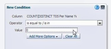
Figure 5 - Condition

Figure 6 - Format when condition is met
- Exclude the “trigger” column from your pivot view. View your results and be satisfied:

Figure 7 - Correct formatting of calculated item.
* Note that this would also allow you to apply visual formatting if you wanted to distinguish this row/column as a total.
Why it works
The use of conditional formatting that applies a data type as part of the format is a straightforward leap of logic, but what to use as the trigger? Most people will try to use the dimension they have setup the calculation in. However, if you try to use the text description given to the calculated item you will find that the condition is never applied: |
| Figure 8 - Condition on dimension |
 |
| Figure 9 - Condition never met, format never applied |
If you try to setup a filter that is true when the dimension is not in reasonable range of values ( in this example we try to format off all years not in the 2000s ) you will find that your calculated item is skipped as well (this has the added vulnerability of being very explicit):
 |
| Figure 10 - Condition on dimension values |
 |
| Figure 11- Condition never met, format never applied |
The reason for all this is that the calculated item “borrows” EACH of the dimension values it operates against. Hence, no matter how inventive your filter is, as long as you are trying to somehow separate the calculated member away from the members it is operating on, you will never succeed. This member “borrowing” is apparent if you add the dimension it operates against to the query a 2nd time, and look at the table view.
 |
| Figure 12 - Calculated item "borrows" members |
But since the “member value” given to the calculated item does not actually exist in the dimension, if you try to perform a count distinct against it, you will always get zero.
 |
| Figure 13 - Count distinct against dimension |
There is your difference; there is your “trigger.” The rest is basic formatting.
1: You might suggest that this requirement is better served using column(s) with time series calculations, and you might be right. However, more often than not the user will want to SEE the time periods being compared ( 2012 vs 2011, or 08/07/2012 vs 08/07/2011). When using facts with time series calculations you will only be able to show “this year” vs “last year” since the column heading of the time series calculated fact will always be static. In these cases you will need to use the base fact and a time dimension, along with the solution provided here.
2: All screen shots, and examples used in this post are performed in Sample App V305. An XML of the final correctly formatted report can be downloaded here.
Subscribe to:
Posts (Atom)